


The first prize for the work “To-From-To” was awarded to SUPERSTUDIO team by the unanimous decision of the jury of the Call for tenders for the design of visual identity, setup and signal system of the Rector’s Palace.
The jury was composed of the following members: Lana Cavar, Iva Letilovic, Maroje Mrduljas, Renata Peros and Koraljka Vlajo. They chose five teams in July 2016 who have worked on proposals for tendering solutions.
At their second session held on 17 September 2016, the jury reviewed the four submitted tendering solutions and unanimously made the decision.
The 1st prize in the gross amount of 80.000,00 HRK took the work under the code 03
Name of the concept: To-From-To (Do-od-do)
Authors: Superstudio / Ira Payer, Iva Hrvatin, Dario Devic, Bojan Kristofic, Zora Salopek Baletic
Justification of the decision:
The visual identity is based on the architecture of the Palace and the most prominent new architectural intervention: specific fractional connecting bridge. This expressive form is integrated in a variation of the letter “M” with vertical elements taken from the serif letters’ family. Consequently, a sign is created that mutates depending on the applications so that the visual identity is not fixed to a single sign, but it is rather a dynamic system. Visual identity conceptually links, skillfully and aesthetically balances contemporary and historical elements thus tightly interprets not only the architecture but also the character of the institution.
This work presents a compelling sequence of applications, from pleasingly resolved posters made of signs and visuals to refined and conceptual signal system. According to the jury, the application is more successful where the sign is less prominent and visually more discreet.
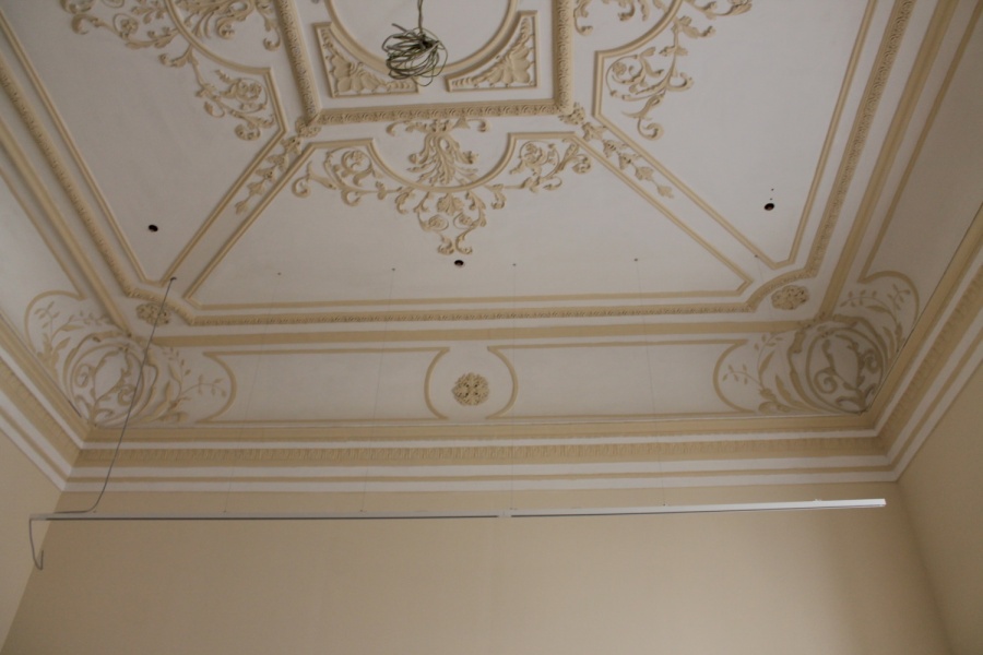
Proposal of the setup resolution is simple, reduced to a set of modular, technically refined elements, and leaves enough opportunities for curators and their further interventions at the same time. Thanks to the discretion of access, the neoclassical architecture of the Rector’s Palace is established. It is the only example of that style in the historical strata of the tremendously rich Zadar peninsula.
The 2nd prize in the gross amount of 40.000,00 HRK took the work under the code 04
Title of the concept: Rector (Rektor)
Authors: Iva Maria Juric, Niko Mihaljevic, Hrvoje Zivcic
Justification of the decision:
The work is based on the impressive new typography – Rector – designed specifically for this occasion. This typography refers to a complex, multi-layered history of the Palace, and suggests several family letters among which are Sans, Outline and Serif, whereby the Sans is expanded into regular and bold versions. Each corresponds with the line, the frame, and the volume, which should serve as a basis for further development, and all three perfectly work as a whole, which then opens a wide range of different typographic applications. The authors have obviously invested considerable effort and knowledge in creation of the Rector, with highly convincing results that fit in the recent trend in which Croatian typography purely flourishes. In further elaboration, the authors give an absolute priority to typography. In other words, the other applications are not convincing on neither the aesthetic nor the conceptual level.
The setup is based on a fairly basic system of modular elements, whereas some of the proposed configurations did not take into account the spatial dimensions and the flow of movement.
Letter Rector, without any doubt, has a bright future regardless of this tender. The jury also points out that the letter confirms the justification of this tender’s implementation since it can generate a new and applied knowledge, regardless of the prize distribution.
The 3rd prize in the gross amount of 20.000,00 HRK took the work under the code 01
Title of the concept: Palace of culture (Kuća kulture)
Authors: Andro Giunio, Marijana Gradecak, Bojan Mucko
Justification of the decision:
The work aims to expand the understanding of the museum towards an idea of a public institution that could have an impact on current peninsula gentrification processes. This work’s visual identity involved a socio-anthropological study as well as a series of interventions in public space.
The visual identity itself is based on a series of frames whose form is taken from a stylized ground plan of the Palace. The authors argue that the proposed system is both “algorithmic” and “relational”, but the jury did not recognize such properties neither when it comes to its solution nor its application, in which modular configuration of frames only vary. Posters, invitations and other applications are sufficiently developed and visually literate, however not particularly memorable. One can gain the impression that the visual identity does not have enough resources to operate as a recognizable system.
The idea of “leakage” of the museum into the public space is reduced to the application of elements for the interior setup, which is distributed at various locations on the peninsula. These external elements bring the content related to “micro-narratives” while they are info-totems at the same time. The concept is almost grotesque both conceptually and dimensionally: Palace’s revived history is being transformed into, as the authors say, “a commemorative plaque”, whereas the frames encompass small scale gardens that would easily be perceived as an error in the public space.
Compensation in the gross amount of 8.000,00 HRK took the work under the code 02
Title of the concept: Roughly within the framework (Okvirno u okviru)
Authors: Group Name / Masa Milovac, Jan Pavlovic, Kristina Volf, Maja Merlic
Justification of the decision:
This work’s visual identity quite literally continues the stratification of the city of Zadar and Rector’s Palace as well as the position of the institution that connects the past, the present and the future. The sign is formed by the typographical superposition which then forms a shape of a solid framework. Furthermore, the sign, in combination with modular treatment of diagonally placed letters, forms a logo. Names should suggest a flow, and the sign should suggest time fixation. The result is a rather complicated solution whose further applications are mainly based on “framing” of content.
The setup introduces complex and advanced installation, so called architecture within an architecture, into the existing rooms. Such intervention would be of interest in a less sensitive context. However, it is just overmuch in this case because, despite the use of lightweight materials, it is still out of step with the original properties of a neo-classicist environment.
On the other hand, the modular exhibit system is witty, technically correct and provides a possibility of creating various exhibition situations.
The fifth chosen team, Damir Gamulin and Antun Sevsek, withdrew their application.
Congratulations to all the awarded authors.
